A collection of published data visualizations and graphics
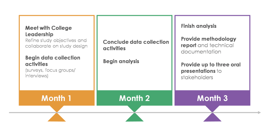
Graphic and timeline created for education program evaluation proposal

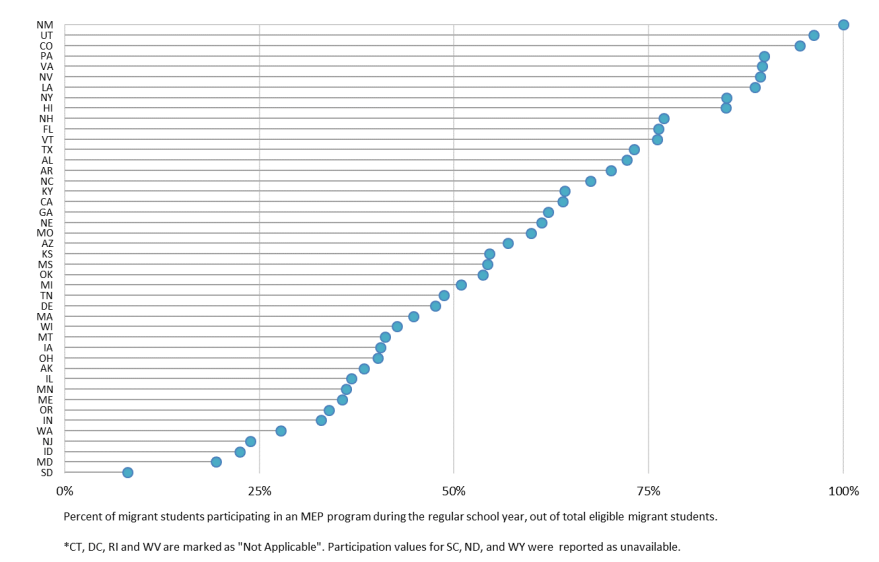
Lollipop graph depicting the percentage of migrant students participating in the Migrant Education Program (MEP) by state
Tile map showing the number of direct (green) and extended (blue) programs across the United States

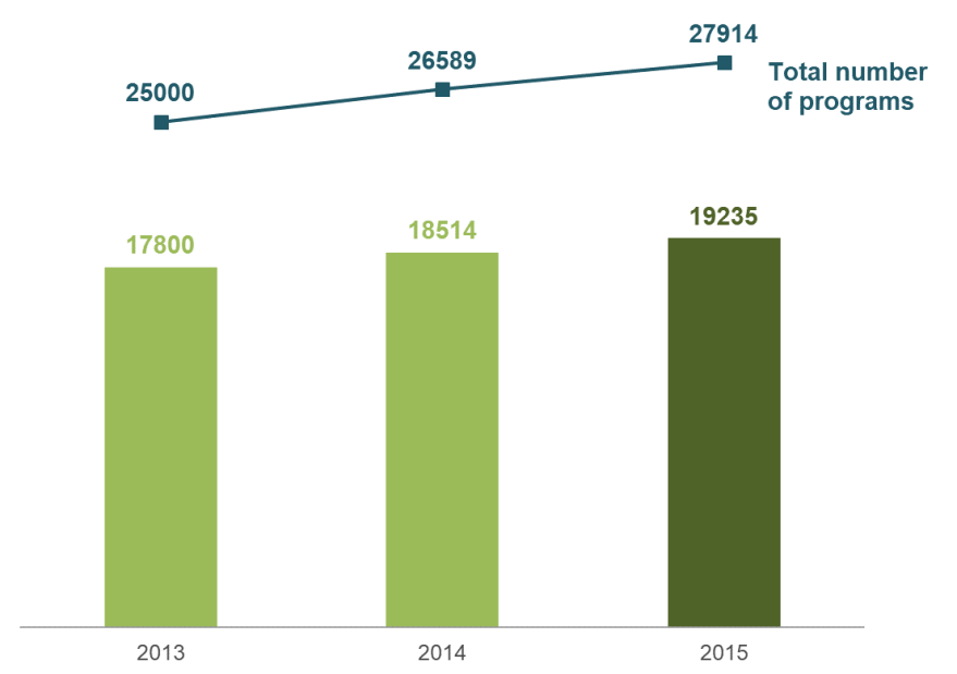
A combination bar/line chart showing the number of traditional teacher preparation programs (bars) against the growth in the total number of programs (line) from 2013 through 2015
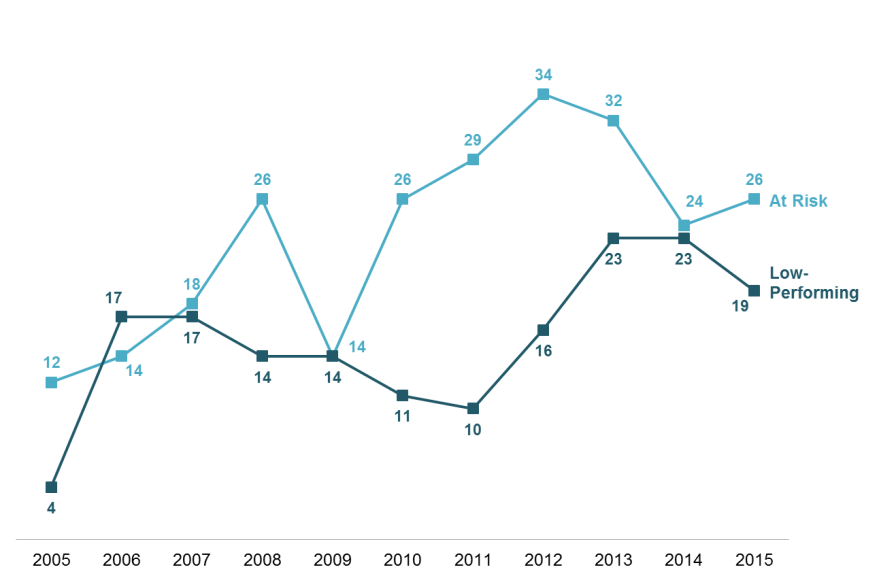
Line graph depicting the total number of at-risk and low-performing teacher preparation programs reported in the United States from 2005 through 2015
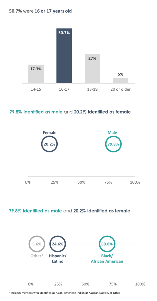
Vertical bar chart and dot plot depicting demographic data for study participants
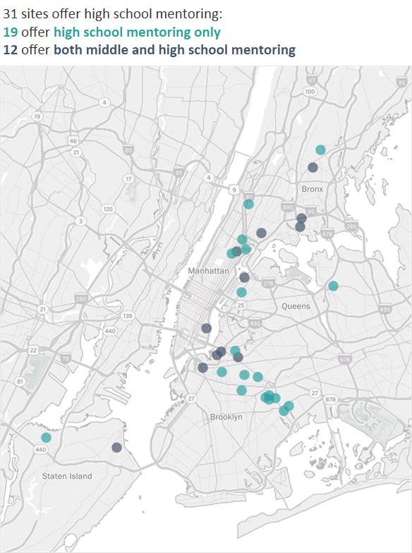
Map of New York City showing the locations of study sites offering high school and middle school mentoring